
티스토리 뷰
HTML
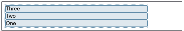
<div class="box">
  <div>One</div>
  <div>Two</div>
  <div>Three
    <br>has
    <br>extra
    <br>text
  </div>
</div>
CSS
.box {
  display: flex;
}
flex-direction 지정
- row
- row-reverse
- column
- column-reverse
|
|
 |
 |
|
|
 |
 |
flex-wrap을 이용한 복수 행 flex 컨테이너 지정
| 항목이 여러 행에 나열 | flex-wrap: wrap; |
| flex 항목들은 컨테이너의 폭에 맞게 | flex-wrap: nowrap ; |
flex-flow
- flex-direction 속성과 flex-wrap 속성을 합침
- 첫 번째 값은 flex-direction이고 두 번째 값은 flex-wrap
| flex-flow: row wrap; |  |
| flex-flow: row-reverse wrap; |  |
| flex-flow: row nowrap; |  |
| flex-flow: row-reverse nowrap; |  |
| flex-flow: column wrap; |  |
| flex-flow: column-reverse wrap; |  |
<자료출처>
https://developer.mozilla.org/ko/docs/Web/CSS/CSS_flexible_box_layout/Basic_concepts_of_flexbox
flexbox의 기본 개념 - CSS: Cascading Style Sheets | MDN
일명 flexbox라 불리는 Flexible Box module은 flexbox 인터페이스 내의 아이템 간 공간 배분과 강력한 정렬 기능을 제공하기 위한 1차원 레이아웃 모델 로 설계되었습니다. 이 글에서는 flexbox의 주요 기능
developer.mozilla.org
https://developer.mozilla.org/ko/docs/Web/CSS/flex
flex - CSS: Cascading Style Sheets | MDN
flex CSS 속성은 하나의 플렉스 아이템이 자신의 컨테이너가 차지하는 공간에 맞추기 위해 크기를 키우거나 줄이는 방법을 설정하는 속성입니다. flex는 flex-grow, flex-shrink, flex-basis의 단축 속성입니
developer.mozilla.org
https://www.w3schools.com/css/css3_flexbox.asp
W3Schools.com
W3Schools offers free online tutorials, references and exercises in all the major languages of the web. Covering popular subjects like HTML, CSS, JavaScript, Python, SQL, Java, and many, many more.
www.w3schools.com
'WEB > css' 카테고리의 다른 글
| 챗GPT가 알려주는 Flexbox (0) | 2025.02.04 |
|---|---|
| [챗GPT가 알려주는] flex css에 사용되는 속성중 align-items, align-content, align-self 차이점 (0) | 2025.02.04 |
| CSS 미디어 쿼리(media query) - 반응형 코딩 (0) | 2024.12.31 |
| hamburgers (0) | 2021.08.19 |
| animate.css (1) | 2021.08.19 |
- Total
- Today
- Yesterday
- 자바스크립트 #javascript #math
- 연명의료결정제도 #사전연명의료의향서 #사전연명의료의향서등록기관 #광주사전연명의료의향서
- 정보처리기사 #정보처리기사요약 #정보처리기사요점정리
- 와이파이증폭기추천 #와이파이설치
- 증폭기 #아이피타임증폭기
- iptime와이파이증폭기 #와이파이증폭기설치
- 테스크탑무선랜카드 #무선랜카드 #아이피타이무선랜카드 #a3000mini #무선랜카드추천
- jdk #jre
- 광주분식 #광주분식맛집 #상추튀김 #상추튀김맛집 #광주상추튀김
- thymeleaf
- 쇼팬하우어 #좋은책
- echart
- lg그램pro #lg그램 #노트북 #노트북추천 #lg노트북
- 좋은책
- // 사진직: 데이터가 없으면 DEFAULT_IMG 사용 const profileSrc = (d.img && d.img !== "") ? d.img : DEFAULT_IMG;('#user-photo').attr('src'
- sw기술자평균임금 #2025년 sw기술자 평균임금
- css미디어쿼리 #미디어쿼리 #mediaquery
- 바지락칼국수 #월곡동칼국수 #칼국수맛집
- ajax
- 자바스크립트break
- 자바스크립트정규표현식
- jQuery #jQuery이미지슬라이드 #이미지슬라이드
- 무료폰트 #무료웹폰트 #한수원한돋움 #한수원한울림 #한울림체 #한돋움체
- 좋은책 #밥프록터 #부의원리
- 썬크림 #닥터지썬크림 #내돈내산 #내돈내산썬크림 #썬크림추천 #spf50썬크림 #닥터지메디유브이울트라선
- 탭메뉴자바스크립트
- SQL명령어 #SQL
- 파비콘 #파비콘 사이트에 적용
- 자바스크립트countiue
- 파비콘사이즈
| 일 | 월 | 화 | 수 | 목 | 금 | 토 |
|---|---|---|---|---|---|---|
| 1 | 2 | 3 | 4 | 5 | 6 | 7 |
| 8 | 9 | 10 | 11 | 12 | 13 | 14 |
| 15 | 16 | 17 | 18 | 19 | 20 | 21 |
| 22 | 23 | 24 | 25 | 26 | 27 | 28 |